About Lens
Lens is the design system built for Loom products. By using the system we create a consistent user experience and we shift our focus to bigger design challenges.
Lens supports design with 4 types of elements:
- Styles
- Components
- Icons
- Illustrations
- Patterns
Consider reading Introduction to Lens and design systems.
How to contribute as a Designer
For an up-to-date contributions guideline, please refer to the official Notion Doc.
Communication with developers
Lens bridges design and development by providing both the same components and styles. Design handoff becomes a conversation about what predefined patterns to use. Naming for components, styles and measurements is shared as well, so we can express decisions with a shared language, like for example: "Let's use ~~16px~~ space-medium".
Some of our compositions and interactions are grouped into patterns and reused to create a consistent user experience. For example, see Form patterns.
Styles
Styles are the core of Lens design. These contain the most granular definition of our visual design. Reusing styles reduces ambiguity and results in a consistent design. Lens Components are built with Lens styles, for example, the Button component uses color, radius and typography styles.
Learn more about Designing Custom Elements.
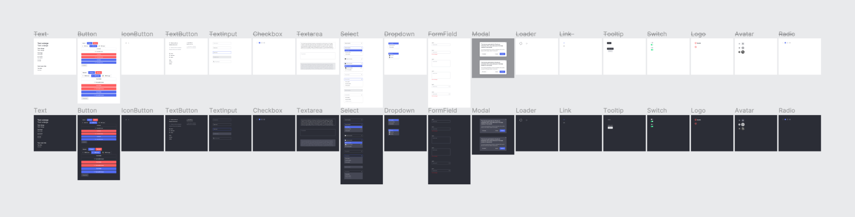
Components
Components are the building blocks of our designs. Because of their simplicity components can be reused to solve many design problems. Learn more about Component definition.
Patterns
Styles and components are highly reusable and can be composed in many ways. Because the composition variations can grow in so many directions, it can result in inconsistent designs that can affect user experience. Patterns solve this problem by grouping compositions and interactions, for example, see Form patterns.
Using Lens with Figma
Lens is recreated in Figma to emulate as close as possible the coded components and styles. There are 2 ways to explore Lens in Figma: by the Assets section on the left panel or by accessing the project files.
Libraries
We use 4 Figma shared libraries:
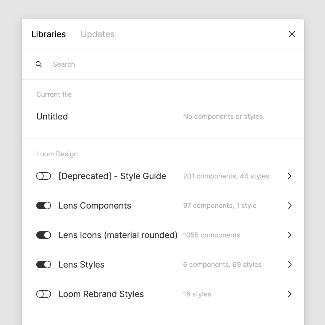
- Lens Components: contains all components and matches with the Components section in this documentation.
- Lens Styles: contains colors, typography and shadows. Radii styles are not yet possible to create in Figma. Semantic spaces are recreated as Figma components.
- Lens Icons: contains all icons and matches with the Icons section in this documentation.
- Lens Illustrations: contains all illustrations and matches with the Illustrations section in this documentation.
These libraries are enabled in all existing and new files by default.
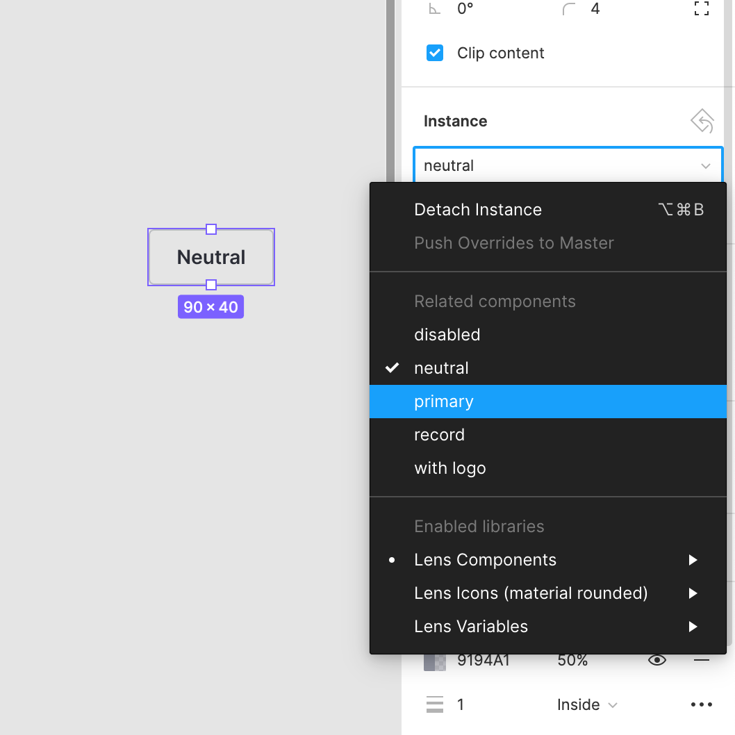
Component configurations
Lens Figma components contain multiple instances to emulate the most commonly used configurations. To fully understand the component capabilities check the component's documentation page.
For example, to understand the Button component, check its documentation, and once decided on the configuration needed, select it from the instances section in Figma.
The documentation gives us the most realistic version of the component. We can interact with it and see its different states like hover, active and focused.