Sometimes components don't fit a specific use case and a custom element is needed. You can design custom UI elements that are not in the components library but still follow the Lens design language.
How to design a custom UI element
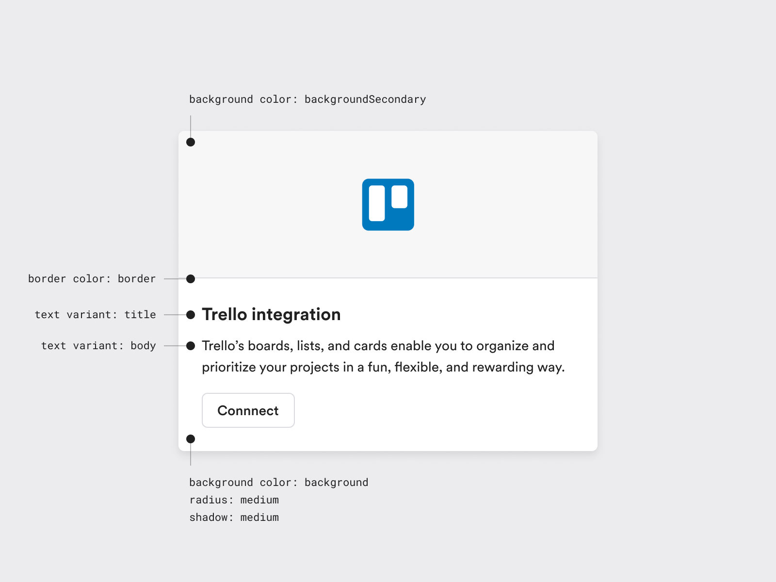
- Use Lens styles to define typography, color and layer styles like border radii and shadows.
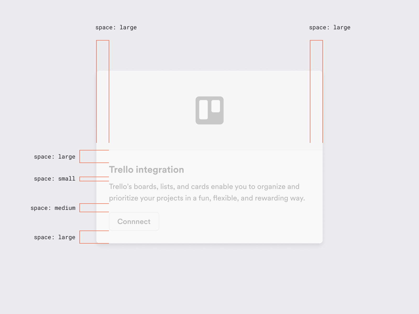
- Use Lens spacing rules to space out elements. If possible, use one of the predefined spacing values, if not, use a value divisible by 8px.
Example case
In this example, we need to design an integration card. We can use Lens text sizes and colors to define the typography. For the card, we can use Lens border-radius and shadow styles. In this case, all spacing can be solved with Lens predefined spacing rules.
The result is a one-off element for a specific use case but it feels like part of Lens design language.